
Hi, I’m Tarlan, a Multimedia Specialist and aspiring UX Designer with over 8 years of experience turning ideas into purposeful and engaging visual content.
Based in Muscat, Oman, I specialize in graphic design, branding, video editing, and digital content creation. My work blends visual creativity with thoughtful problem-solving.In recent years, I’ve been expanding into UX design through self-study and hands-on projects. I’ve explored user research, wireframing, and prototyping in Figma and developed UX case studies focused on improving real-world tools, including internal systems used for finance and administration.Beyond design, I have a strong background in finance and bookkeeping, office operations, and digital marketing. This gives me a well-rounded, business-aware approach to design, especially when working on products that require clarity, usability, and trust.I’m proficient in Adobe Creative Suite, Figma, Canva, WordPress, and a range of productivity tools. I’m always learning, exploring new trends, and looking for ways to grow creatively and strategically.Let’s bring great ideas to life—together.
Explore My Work
Let’s Connect
UX Case Studies
A selection of self-initiated and course-based UX case studies created through research, iteration, and user-centered design practices.
Improving the iPay System for Better Usability
Project OverviewThis project focuses on evaluating the current iPay system to uncover usability issues and inefficiencies. The goal is to redesign the system into a more intuitive, user-friendly platform that meets users’ real needs and supports smoother task completion.Role: UX/UI Designer
Tools Used: Figma, Microsoft Paint, Microsoft Office
Project Type: Personal
Duration: 4 Weeks (1 Month)
Platform: Responsive Web
GoalIdentify key pain points in the current iPay system and redesign it to enhance usability, streamline user workflows, and improve overall user satisfaction.
Evaluation of the Current User Experience
Current system interface and user guide reference➤ From the homepage, users can access core system features such as:1. Accessing System Functions
From the Simple Homepage, users can access Oracle E-Business Suite functions by selecting the global Navigator button, which opens the navigation menu and a search input field.2. Using Favorites for Quick Access
Users can navigate to frequently used functions or web pages by selecting items saved under Favorites.3. Managing User Preferences
The global Settings button provides access to Preferences and other global settings via a dropdown menu.4. Handling Notifications
The Worklist displays the most recent notifications, allowing users to view or respond directly from this section.
⚠️ Users report frequent session timeouts, requiring them to log in multiple times during a single workflow.
This usually happens due to session timeout settings that are too short or poorly managed.
🔍 Session Timeout
| Pros | Cons |
|---|---|
| Protects sensitive data if a user leaves a device unattended. | Interrupts workflow. |
| Reduces risk of unauthorized access. | Frustrates users, especially during long tasks. |
| ... | Leads to potential data loss or duplicated effort. |
⚠️ The homepage menu occasionally fails to load or disappears, affecting navigation.This issue is likely caused by front-end rendering problems or backend request failures.
🔍 Root Causes (Technical Triggers)
| Cause | Description |
|---|---|
| JavaScript Crash | JS error prevents the menu from rendering. |
| Slow API Call | The Backend fails to fetch navigation data in time. |
| CSS Bug | Styling issues cause the menu to collapse or hide. |
| Session Bug | Menu tied to session state, disappears when session expires. |
| Cache Issue | The browser loads outdated or corrupted files. |
⚠️ iPay’s interface is not responsive across screen sizes and has no structured mobile layout.
User Research - Informal Contextual InquiryInstead of traditional interviews, I gathered insights through informal conversations and firsthand observation of daily usage.Approach Taken:• Engaged in casual discussions with the 3 primary users of the iPay system (including myself).
• Observed repeated behavior patterns and bottlenecks during task completion.
• Reflected on my own frustrations and challenges from regular use.Key Findings:• Frequent session timeouts disrupted workflows.
• Navigation was unclear due to inconsistent or disappearing menus.
• Users felt the process was unnecessarily complex with too many steps.
• Lack of beginner guidance increased dependency on more experienced users.
• Poor Mobile Responsiveness & Interface Design make performing key tasks, like viewing invoices or processing payments, difficult when users are on the go.
Problem StatementThe current iPay system presents several usability and functionality issues that negatively impact the user experience and workflow efficiency. Key problems identified include:1. Inefficient Payment Process
The invoice payment flow involves too many steps, leading to delays and user frustration.2. Unreliable Navigation Menu
The homepage menu often fails to load properly, requiring users to refresh the page multiple times or wait unnecessarily.3. Overwhelming Interface
Excessive and irrelevant menus and tabs clutter the interface, making navigation unintuitive.4. Lack of Onboarding or Guidance
The system provides little to no guidance for first-time users, resulting in a steep learning curve.5. Aggressive Session Timeout
Sessions expire too quickly without any warning or prompt to extend them, disrupting tasks.6. Poor Session Recovery
When a session times out, users are forced to restart their entire workflow. This is especially problematic during time-sensitive actions like payments.7. No Credit Application Option
Users are unable to apply available credits to invoices, limiting flexibility in payment options.8. Outdated User Interface
The overall design feels outdated and lacks modern usability principles such as responsiveness, clarity, and accessibility. iPay is not mobile-friendly and presents a clunky interface across devices.9. Ambiguous Invoice Link Functionality
Clicking the invoice number performs multiple actions (PDF download and payment initiation), which can confuse users or lead to unintentional steps.
Usability Analysis - Competitor BenchmarkingI compared iPay with leading alternatives like PayPal and Oman’s Thawani app to assess how competitors handle usability:
| Feature | iPay | PayPal | Thawani |
|---|---|---|---|
| Menu Load Reliability | ❌ Inconsistent | ✅ Stable | ✅ Stable |
| Steps to Complete Payment | 5+ | 2–3 | 2–3 |
| User Guidance | ❌ None | ✅ Contextual | ✅ Guided flow |
| Session Timeout Handling | ❌ Abrupt | ✅ Graceful | ✅ Graceful |
| Mobile Responsiveness | ❌ Poor/Unusable | ✅ Fully Responsive | ✅ Mobile-first |
| Mobile Responsiveness | ❌ Poor/Unusable | ✅ Fully Responsive | ✅ Mobile-first |
| Interface Design | ❌ Outdated | ✅ Clean/Modern | ✅ Simple & Visual |
Low-Fidelity WireframesThese low-fidelity wireframes explore an improved structure for the iPay system, prioritizing usability through clearer content hierarchy, simplified layout, and faster access to core functions.
Low-Fidelity Usability Testing FeedbackA colleague provided feedback on the low-fidelity wireframes, noting that the design clearly focuses on structure, clarity, and simplifying the user journey. The layout felt functional and intentionally minimal, which is appropriate for this design phase. Overall, it was described as clean, well-structured, and a solid foundation to build upon.To test the primary usability of the redesigned system, I conducted an informal usability session where my colleague interacted with the wireframes while I observed. Together, we identified the following area for improvement:
| Issue | Suggested Fix |
|---|---|
| Repetitive Actions: Buttons such as “Pay” and “Apply Credit” were repeated in multiple places, which made the interface feel cluttered and potentially confusing. | Replacing the repeated buttons with a single, clear link or action button that directs users to a unified payment interface. |
| Filters Section: Appears functional, but could get overwhelming with multiple options. | Using collapsible or dropdown filters for better space management. |
| Navigation Bar: Some icons in the low-fidelity wireframes were not immediately intuitive for the user during testing. | In future iterations, consider adding text labels alongside icons or implementing hover tooltips to clarify their purpose. This will improve recognition and reduce cognitive load, especially for first-time users. |
🛎️ Stay Tuned...Work in Progress!
MediTracker:
A Responsive Web App for Medicine Management,
UX/UI Case Study
Project OverviewThis project focuses on evaluating the current iPay system to uncover usability issues and inefficiencies. The goal is to redesign the system into a more intuitive, user-friendly platform that meets users’ real needs and supports smoother task completion.Role: UX/UI Designer
Tools Used: Adobe XD / Photoshop, Microsoft Office
Project Type: Personal / Conceptual
Duration: 8 Weeks (2 Months)
Platform: Responsive Web (Mobile-First Approach)
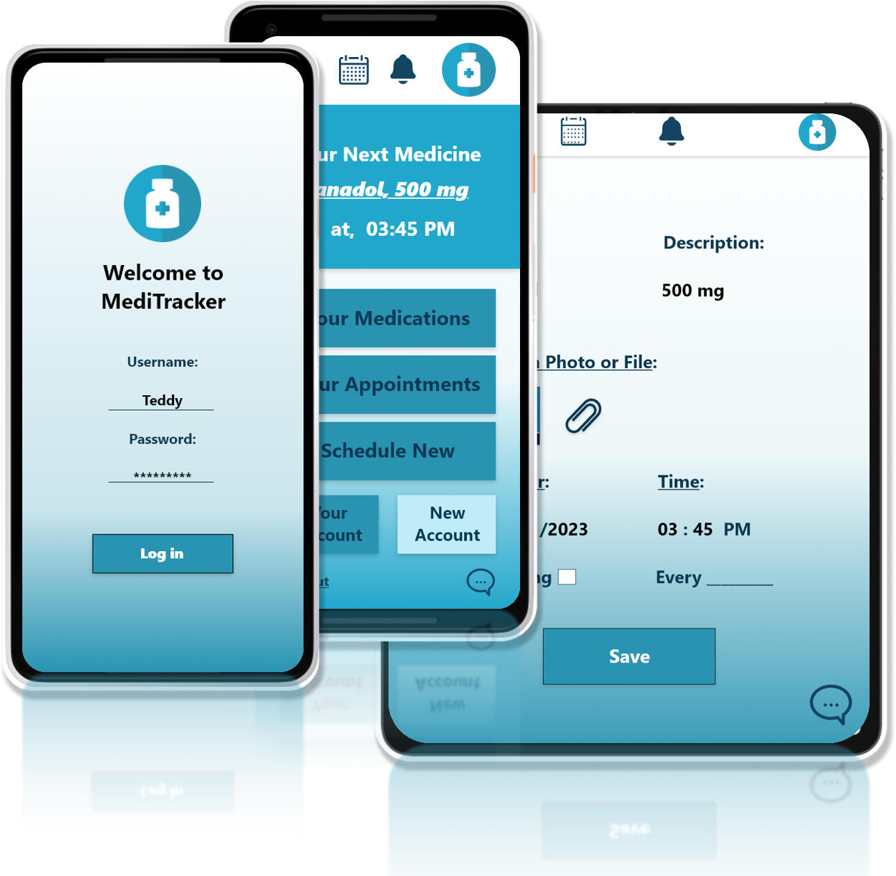
Problem StatementMany people, especially the elderly and chronically ill, struggle to keep track of their medications.
Missed doses, double intakes, and medication confusion can lead to serious health complications.
GoalDesign a responsive web app that enables users to:
- Track their daily medications
- Set up reminders
- View dosage schedules
- Manage prescriptions easily
Target Users- Adults managing long-term medication
- Caregivers assisting patients
- Elderly individuals needing reminders
Design ProcessMediTracker was built following a Design Thinking approach:1. Empathize
2. Define
3. Ideate
4. Prototype
5. Test
EmpathizeUser Interviews
Conducted 5 user interviews focusing on:
- Daily medication habits
- Pain points in managing prescriptions
- Preferred digital toolsKey Insights:
- Users forget doses without reminders
- Paper prescriptions are hard to track
- Mobile accessibility is crucial
DefineProblem Statement
“People need a simple, intuitive platform to manage their medications, track doses, and receive timely reminders to stay healthy and consistent.”User PersonasPersona 1: Ahmed, 25
- IT student recovering from a recent injury while preparing for graduation and job hunting
- Needs a medication-tracking app to help organize his pill schedule and ensure timely intakePersona 2: Linda, 54
- Busy math teacher and mother recently diagnosed with diabetes
- Needs reminders for both medication and doctor appointments due to her packed daily routine
IdeateUsed Crazy 8s, brainstorming sessions, and How Might We questions:
HMWs:
- HMW help users remember to take medications?
- HMW make medication tracking feel rewarding?
- HMW reduce confusion around dosages?Created Paper wireframes first, then low-fidelity Digital Wireframes on Adobe XD.
PrototypeDesigned low and high-fidelity prototypes using Adobe XD.Key Features:
- Medication Dashboard
- Add Medication (Name, Dosage, Time, Duration)
- Daily Reminder Notifications
- Prescription History
- Responsive Layout (Mobile, Tablet, Desktop)*********************🔗 View the Low-fidelity Prototype: Click here🔗 View the High-fidelity Prototype: Click here
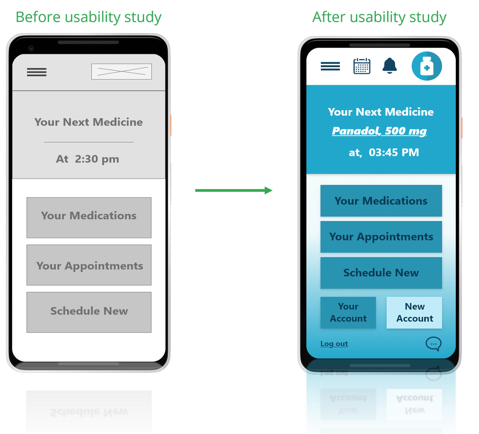
TestUsability Study: FindingsA usability study was conducted to evaluate the functionality, accessibility, and overall user experience of the MediTracker prototype. Five participants were asked to perform common tasks such as signing up, setting medication reminders, and exploring app features.Key Findings:1. Security Matters
Users expressed the importance of securing their medical data. They appreciated having the option to log in with a username and password, which made them feel their personal health records were safe.2. Account Setup Needs Simplification
Some users found the account creation process slightly confusing or time-consuming. Clearer instructions and more intuitive input fields are needed to streamline onboarding.3. Desire for a Centralized Notification Area
Users liked having a dedicated notification space where they could view alerts about medications and doctor appointments. This feature helped them feel more organized and in control.MockupsBased on the insights gathered from the usability study, several key design improvements were implemented to enhance the user experience:- Notification Area:
A dedicated notification section was added, allowing users to easily view alerts for upcoming medications and doctor appointments. This helps users stay organized and ensures they don’t miss important tasks.- Login & Logout Functionality:
To address user concerns around data privacy and security, login and logout buttons were introduced. This ensures that personal health records are protected and only accessible to the user.These updates were reflected in the high-fidelity mockups for both mobile and desktop versions of the app.
Responsive DesignAdopted a mobile-first approach and expanded to tablet and desktop screens.Focused on:
- Touch-friendly UI for phones
- Optimized font sizes and buttons
- Consistent experience across devices*********************📱 Mobile: Click here to view
📲 Tablet: Click here to view
Accessibility ConsiderationsDesigning with accessibility in mind was a key priority throughout the development of MediTracker. The goal was to ensure the app is usable for individuals of all ages and abilities.Key Accessibility FeaturesLarge Buttons and Links
Buttons and clickable elements are designed to be visually prominent and easy to tap, especially on mobile devices. This improves usability for elderly users and those with motor impairments.Readable Fonts and High Contrast
Font sizes and color contrast were optimized to support users with visual impairments or low vision.Clear Icons and Labels
Icons are clear and easy to navigate for users with cognitive challenges.
TakeawaysImpact
- Users appreciated that the app is simple, clear, and easy to navigate.
- The core features, medication reminders, scheduling, and login/logout security, met their needs effectively and provided a sense of control over their health routines.What I Learned
- Gained hands-on experience in the UX design process, from research to prototyping and testing.- Improved proficiency in Adobe XD, particularly in designing responsive interfaces and building interactive prototypes.Next Steps
1. Measure App Success
Conduct follow-up research and gather user feedback to evaluate the app’s long-term impact, engagement, and effectiveness.2. Add Informational Pages
Include a dedicated section that provides trusted medical information or guidance about commonly used medications.3. Integrate Location Services
Add a map feature that helps users locate nearby clinics, pharmacies, or healthcare providers, improving convenience and access to care.
Cloud Café Website Case Study
Project OverviewCloud Café is a fictional café brand that needed a visually appealing and functional website to improve online presence, attract new customers, and offer essential information such as menu, contact details, and location.
This case study walks through my end-to-end UX/UI design process, from research to final prototype.🔹Role: UX/UI Designer
🔹Tools Used: Figma, Adobe XD / Photoshop, Microsoft Office
🔹Project Type: Personal / Conceptual
🔹Duration: 17 Weeks (4 Months)
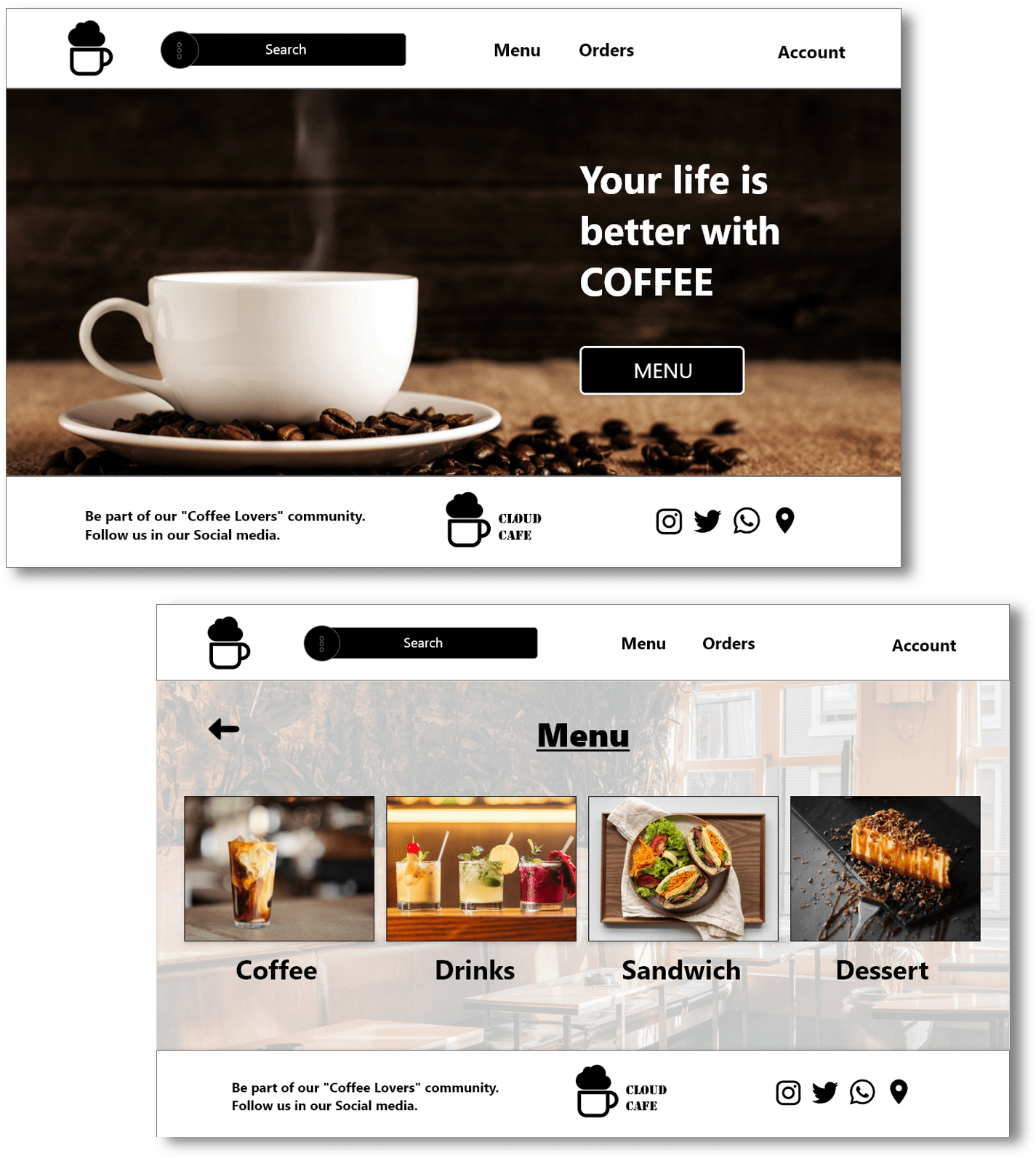
Problem StatementMany small cafés lack a cohesive and engaging online presence, making it difficult for customers to discover them or learn about their offerings. Cloud Café needed a platform that not only communicates its brand identity but also enhances user experience with clear navigation and accessibility.🔹Key Challenges:- Absence of an existing website
- Lack of visual brand identity online
- Need for mobile responsiveness and simplicity
Project GoalsThe primary goal of this project was to design a clean, modern, and responsive website that:- Reflects the café’s cozy and welcoming atmosphere
- Provides clear access to the menu, contact, and location
- Is easy to navigate and mobile-friendly
- Encourages users to visit the café or place inquiries
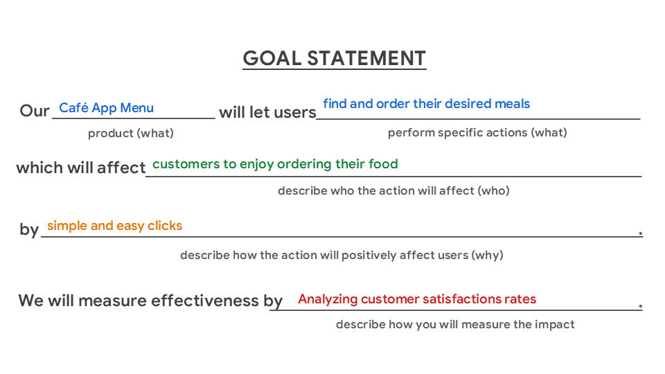
ResearchI conducted competitive analysis and user persona development to better understand user needs and industry standards.Competitive Analysis
I studied 4 local and global café websites. Key findings included:- Simple navigation increases user satisfaction
- High-quality images of products boost engagement
- Customers value mobile responsiveness and fast load timesUser Persona & Journey Map
Created a persona based on potential café-goers:
Name: Jenna, 25
Occupation: Hair Stylist
Needs:
- Quick and Easy Access to Information
- Clear and Detailed Menu Information
- Accurate Food Representation
- Functional and Reliable App Experience
- Social Convenience
- Support for Non-Cooks
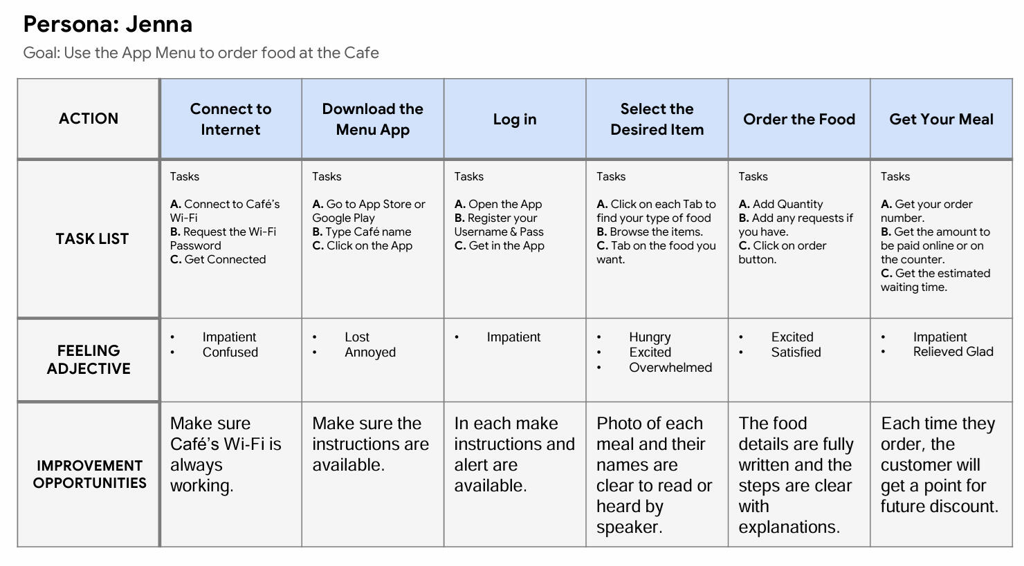
User Journey Map
To better understand how users like Jenna interact with a café’s digital experience, I mapped out her journey from discovering the café to placing an order. This journey highlights her needs for speed, clarity, and accurate food representation, and helps identify key pain points and opportunities to improve the overall user experience.
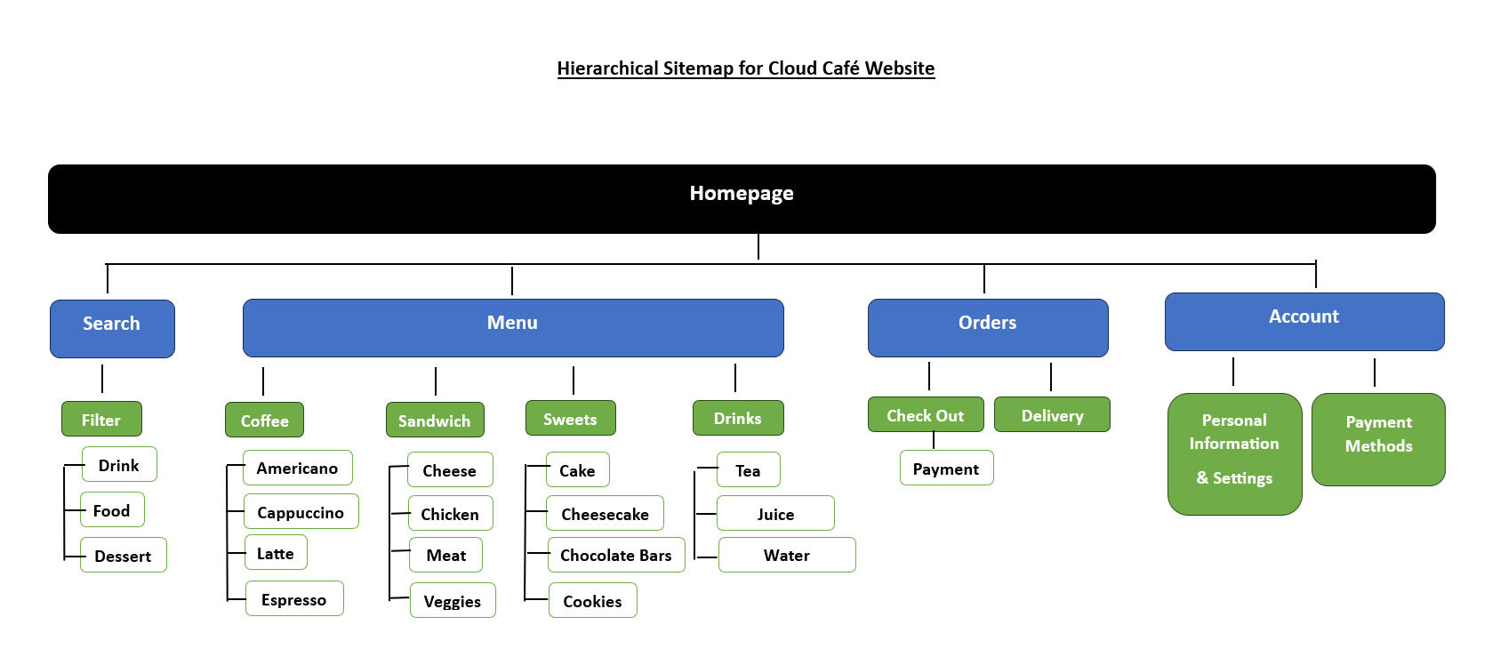
SitemapTo structure the content in a logical and user-friendly way, I created a sitemap outlining the main pages of the Cloud Café website. This helps ensure that users can easily navigate the site and find essential information, like the menu, location, and contact details, without confusion.
The sitemap serves as the foundation for planning the user flow and designing intuitive navigation.
WireframesI began with low-fidelity wireframes to structure the website’s core layout before refining it into mid- and high-fidelity designs.
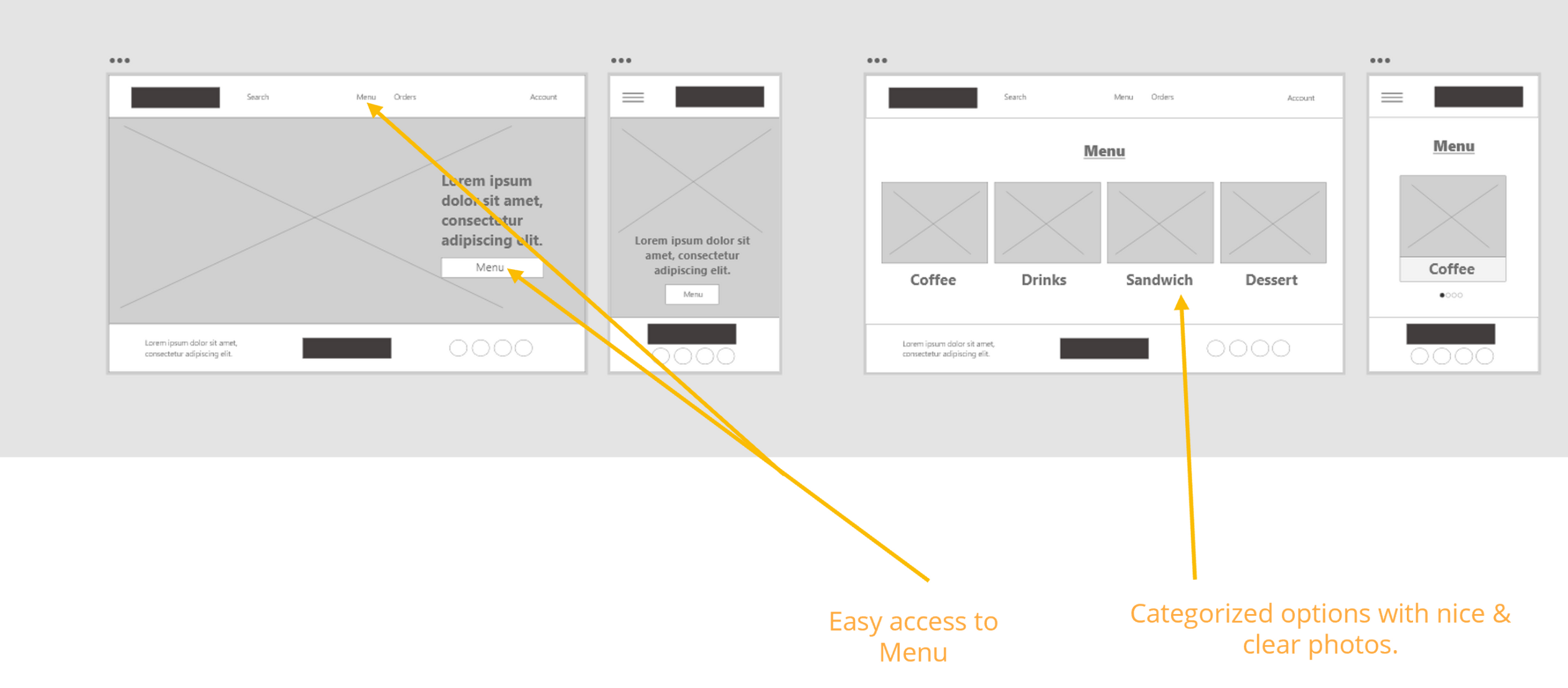
Low-Fidelity PrototypeBefore jumping into visual design, I created low-fidelity wireframes to explore the structure, layout, and user flow of the website. These sketches focus on content placement and functionality without visual distractions, allowing for quick iteration and feedback. This step helped ensure a clear and intuitive experience from the start.
🔗 View the Prototype: Click here

Usability StudyTo evaluate the usability and overall experience of the Cloud Café website prototype, I conducted an unmoderated usability study. This allowed participants to interact with the design in a natural environment and provide honest feedback without real-time guidance.Study Parameters🔹Study Type: Unmoderated usability study
🔹Location: At the Cloud (remote)
🔹Participants: 5 individuals
🔹Duration: 20–30 minutes per sessionParticipants were asked to complete key tasks, such as browsing the menu, placing an order, and creating an account. Their interactions and feedback were analyzed to uncover usability issues and areas for improvement.
🔹Key Findings:The usability study revealed several important insights:1. Card Payment Confusion
One participant was unclear about the type of card accepted during checkout. The payment options lacked clarity and needed clearer labeling or visual cues.2. Limited Meal Options
Multiple participants felt that the menu could offer more variety. They wanted to see additional meal choices or seasonal specials to keep the experience fresh.3. Account Creation Friction
Users found the account creation process slightly confusing, particularly around password requirements and confirmation steps. A simplified or optional account setup was suggested.
High-Fidelity MockupsAfter refining the structure and incorporating feedback from the usability study, I developed high-fidelity mockups that bring the Cloud Café website to life.
These designs reflect the brand’s cozy, minimalist aesthetic while prioritizing clarity, usability, and responsiveness. Each section was carefully crafted to ensure a smooth and engaging user experience across both desktop and mobile devices.
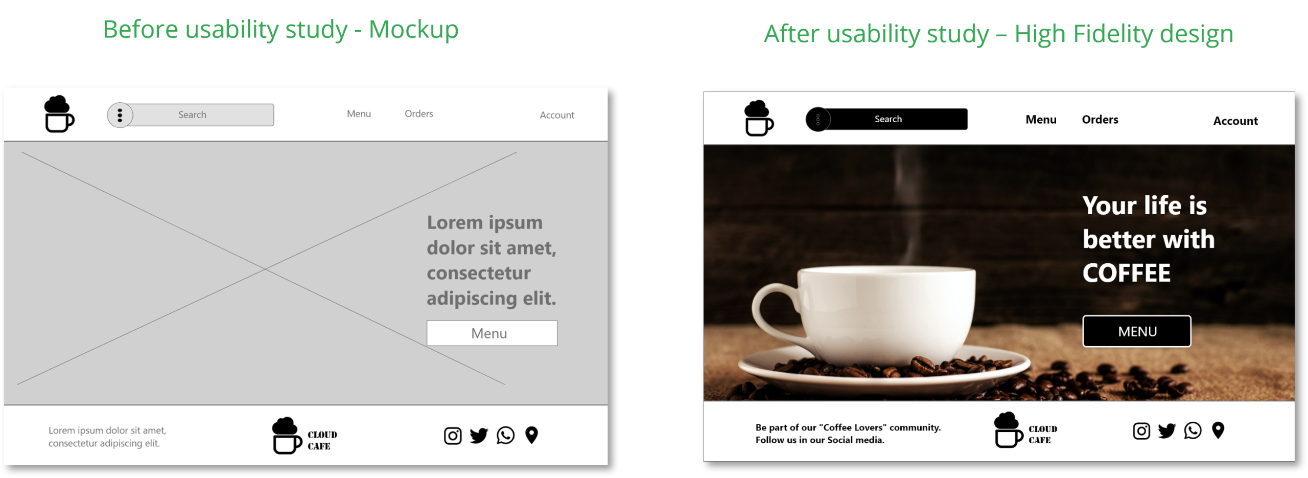
High-Fidelity PrototypeThe high-fidelity prototype was created in Adobe XD to demonstrate the final design with realistic visuals, interactions, and responsive behavior. It includes smooth transitions between pages, clickable buttons, and a complete user flow—from browsing the menu to placing an order.
This prototype was also used for user testing to simulate a real browsing experience and gather actionable feedback.🔗 View the Prototypes💻 Desktop: Click here to view
📱 Mobile: Click here to view

UI DesignThe visual design of Cloud Café reflects the cozy, welcoming atmosphere of the café itself, with a focus on clarity, warmth, and simplicity. The UI aims to balance aesthetic appeal with functionality, creating a delightful experience across devices.Elements
🔹Navigation Bar: Minimal and sticky for easy access
🔹Menu Cards: Clean layout with photos, descriptions, and prices for better decision-making
🔹Call-to-Action Buttons: Clearly labeled and consistent in shape and color to enhance discoverability
🔹Footer: Contains all essential links and contact info, following a clean grid layout
Final DesignHere is the final prototype of the Cloud Café website, featuring smooth scrolling, clear CTAs, and visually rich imagery to evoke the café experience.
Responsive DesignThe website was designed to adapt to various screen sizes. The mobile layout simplifies the navigation and ensures all key actions are easily accessible.
Accessibility ConsiderationsDesigning an inclusive experience was a key part of this project. I made several accessibility-focused choices to ensure the website is usable for a wide range of users, including those with visual or cognitive impairments.🔹Clear Visual Hierarchy
Headings were styled with varying text sizes and weights to establish a strong visual hierarchy. This helps users navigate content more easily, especially those using screen readers or with attention-related challenges.🔹Color Contrast
I selected color combinations with sufficient contrast ratios to ensure readability for users with low vision or color blindness. This enhances legibility across backgrounds, buttons, and text elements.
TakeawaysImpact
The Cloud Café now has a functional and visually appealing website that not only allows customers to browse the menu but also place online orders and request deliveries. This added convenience makes the café more accessible to busy users, improving customer satisfaction and increasing the potential for repeat orders.What I Learned
Throughout this project, I gained hands-on experience in conducting user research, building personas, mapping journeys, and applying user-centered design principles. I also deepened my understanding of prototyping and designing interfaces using Adobe XD, while learning how to test and iterate based on real user feedback.Next Steps1. Conduct follow-up usability testing to evaluate the effectiveness of the final design.
2. Identify additional user needs and pain points through analytics and feedback.
3. Explore new features such as a loyalty program, live chat, or customizable meal options.
4. Continue improving accessibility and responsiveness based on user behavior.
UX Thinking in My Multimedia Work
KUDOS LLC — Muscat, Oman
Multimedia & Digital Designer | 2017 – Present
Although I wasn’t hired as a UX Designer, many of my responsibilities at KUDOS LLC required applying UX thinking, from improving workflows to designing websites and content with users in mind.
Key Contributions
- Designed user-friendly websites using Adobe XD and WordPress, improving user interaction and overall experience.- Created promotional campaigns and branding assets across digital and print platforms, enhancing visual consistency and client engagement.- Produced motion graphics and marketing videos, increasing product visibility and contributing to higher sales.- Led content strategy and execution for social media, resulting in notable growth in engagement and followers.- Collaborated with cross-functional teams to ensure brand consistency across marketing, sales, and admin channels.- Streamlined internal workflows by implementing automation tools and clear documentation, improving team efficiency.- Managed financial operations, including budgeting and inventory, using tools like QuickBooks and Tally Prime.
🔹 Redesigned outdated client websites by applying UX principles to solve usability issues and improve user engagement.Problem
Clients had outdated websites with cluttered layouts, unclear navigation, and inconsistent branding, which led to user confusion and high drop-off rates.Solution
I redesigned the websites using Adobe XD to map user flows and create intuitive wireframes, then built responsive layouts in WordPress with clear visual hierarchy and simplified navigation.Outcome
This improved the user experience by making content easier to find, reducing bounce rates, and led to increased engagement, especially on mobile devices.
🔗 View the Website: Click here
🔹 Planned, designed, and managed cross-platform promotional campaigns to solve inconsistent branding and low audience engagement.ProblemClients struggled with inconsistent branding across digital and print channels, which weakened brand identity. Additionally, the lack of bilingual content limited reach and engagement among Arabic-speaking audiences.SolutionI planned, designed, and managed bilingual promotional campaigns (Arabic & English) to unify brand identity and improve communication. This included:
- Creating cohesive visual systems for both language audiences
- Designing bilingual assets for social media, web, and print
- Adapting layout, typography, and alignment for RTL (Right-to-Left) and LTR formats
- Scheduling and publishing content strategically for diverse user groups
- Aligning messaging across teams and platformsOutcome- Achieved consistent bilingual branding across all touchpoints
- Increased user engagement and improved communication clarity
- Expanded client reach to both English and Arabic-speaking audiences
- Strengthened recognition and professional presence in the market
🔗 View the Instagram Page: Click here
🔗 View the Facebook Page: Click here
🔹 Marketing Video Production & Motion GraphicsProblemThe brand lacked dynamic content to capture user attention online, leading to low engagement and weak product visibility, especially on platforms like YouTube and social media.SolutionI produced and edited animated marketing videos and branded motion graphics using a combination of rapid tools (Animaker, Canva) and custom design assets (Photoshop, Illustrator).Key actions:- Created explainer videos, social reels, and product highlights
- Designed custom graphics to maintain brand consistency
- Optimized pacing, text overlays, and visual hierarchy for engagement
- Edited content for YouTube and social platforms, adjusting formats for eachOutcome- Significantly increased product visibility and audience retention
- Contributed to improved sales and social engagement metrics
- Helped establish a stronger video presence across platforms, especially YouTube and Instagram
🔗 View the Video on YouTube: Click here
Digital Art Series
A collection of artworks created through spontaneous inspiration while exploring digital design techniques and compositions. Each piece reflects experimental approaches to form, color, and layout.
States of Being
Created in Photoshop, this series explores emotional states through digital composition. Each piece is built around a single vibrant color and features elements chosen to represent the meaning of its title—Balance, Flow, and Love.
Wings & Petals – Butterfly Series
Created in Photoshop, a digital art series inspired by nature's delicate harmony, where fluttering wings meet blooming petals. Each piece blends carefully selected color palettes with the organic beauty of butterflies and flowers, exploring themes of grace, growth, and transformation. I explored composition, shading, and painting filters to enhance depth and visual interest.
Moody Rainy Scene
Crafted in Photoshop, this piece captures a somber, rain-soaked atmosphere. Through careful manipulation of stock photos, blending modes, and gradient overlays, I created a retro-inspired look with a touch of melancholy. I focused on composition, photo mixing, and a selected color palette to achieve a nostalgic feel.
Whispers of Love
Created in Photoshop, this series is inspired by Valentine’s Day and explores themes of love, connection, togetherness, and shared moments. Each artwork uses layered images, patterns, and filters, with a red and blue color palette—red symbolizing love, and blue representing peace. The vintage aesthetic enhances the emotional depth and timeless feel of the pieces.
Moons by Palette
Created in Photoshop, this piece centers on a large moon surrounded by galaxies. A vibrant three-color palette is applied only to the moons, creating a striking contrast against the dark, moody backdrop. Through layered imagery, blending modes, and shadow work, the composition evokes a sense of depth and cosmic mystery.
Red Circle Dreams – Japan
This series is a visual meditation on Japanese symbolism and emotion — anchored by the iconic red circle of the Japanese flag. Each piece draws from elements of tradition and nature, created in Photoshop through thoughtful composition and image layering to evoke a sense of cultural depth and beauty.
Echoes of the Wild
I captured photographs of mountains, sea, and sky, then designed each piece with a central circle in varying colors. Using Photoshop, I applied shadows and blending modes to unify the natural elements. Each composition features an animal connected to the landscape, adding a symbolic layer to the design.
Drawn by Fate – Tarot
Three cards. Three paths. One pull of fate.
This mini-series reimagines tarot through a personal, symbolic lens. Each card is a visual interpretation of energy, archetype, and emotion.
I pulled three tarot cards—The Magician, The Star, and Three of Swords—and reinterpreted them through my personal vision. The Magician represents manifestation, The Star symbolizes hope, and the Three of Swords reflects emotional pain, release, and healing. Using Photoshop, I incorporated symbolic elements and carefully selected color palettes to convey the essence of each card.
Lady in Sketch
Using Photoshop filters and manipulations, I transformed stock photos of women into sketch-like artworks. Through blending modes, shadows, and highlights, I created a stylized, textured effect that gives each portrait a unique, illustrative quality.
Playing Cards
Using Adobe Illustrator and Photoshop, I gave traditional playing cards a sporty twist.
I added quirky characters, soccer-themed details, and a bit of creative chaos to turn these classic cards into a fun, unexpected celebration of the game.
Collaborative Works
A selection of digital designs I created for others, including music cover art, personal commissions, and creative collaborations. Each piece reflects someone else's vision, translated through my design lens.
Music Cover Art for Farnoodex
I created these digital cover artworks for Farnoodex, an uplifting and progressive trance music producer. The designs were inspired by tarot cards, visually reflecting the meanings behind each track. Using symbolic imagery and a mystical aesthetic, each piece connects the emotion of the music to the spiritual tone of the cards.🌐 Farnoodex: Website🟢🎵 Farnoodex: Spotify
Exploring Color Palettes
A series of digital artworks inspired by color harmony, contrast, and emotion.
The Magic of the Mixer Brush
These artworks were created in Photoshop using the Mixer Brush Tool to explore color palettes and blending techniques. I focused on smooth transitions and abstract forms to create expressive, visually engaging pieces.
Waves of Color
I used Adobe Illustrator scripts to create oil paint, liquify, and paper cut effects with selected color palettes. Final touches, including filters and edits, were added in Photoshop to enhance texture and depth.
Digital Brushwork
These pieces explore Photoshop brushes, color palettes, and gradient fills to create vibrant, textured visuals. Each artwork reflects experimentation with form, color, and digital techniques.
Cat in the House
This piece explores color palettes, shapes, and shadows to create a cozy scene of a cat indoors. I focused on composition and lighting to bring warmth and personality to the artwork.


![Jenna Persona [Cloud Cafe Website] Jenna Persona [Cloud Cafe Website]](assets/images/gallery19/8ad1f03d.jpg?v=7455d8dc)
![Jenna User Journey Map [Website] Jenna User Journey Map [Website]](assets/images/gallery19/130e8e22.jpg?v=7455d8dc)
![Homepage [Cloud Cafe Website] Homepage [Cloud Cafe Website]](assets/images/gallery18/d0bb22ca.jpg?v=7455d8dc)
![Menu [Cloud Cafe Website] Menu [Cloud Cafe Website]](assets/images/gallery18/5cd4da71.jpg?v=7455d8dc)
![Coffee Menu [Cloud Cafe Website] Coffee Menu [Cloud Cafe Website]](assets/images/gallery18/10e201fc.jpg?v=7455d8dc)
![Americano Coffee Menu [Cloud Cafe Website] Americano Coffee Menu [Cloud Cafe Website]](assets/images/gallery18/0de03e6c.jpg?v=7455d8dc)
![Regular Americano Coffee Menu [Cloud Cafe Website] Regular Americano Coffee Menu [Cloud Cafe Website]](assets/images/gallery18/30b5f37b.jpg?v=7455d8dc)
![Orders Screen Final [Cloud Cafe Website] Orders Screen Final [Cloud Cafe Website]](assets/images/gallery18/7aaa248a.jpg?v=7455d8dc)
![Pay Screen Final [Cloud Cafe Website] Pay Screen Final [Cloud Cafe Website]](assets/images/gallery18/f2a5ccff.jpg?v=7455d8dc)
![Thank You Screen Final [Cloud Cafe Website] Thank You Screen Final [Cloud Cafe Website]](assets/images/gallery18/14948419.jpg?v=7455d8dc)
![Mockups Screen size variations (Mobile) [Cloud Cafe Website] Mockups Screen size variations (Mobile) [Cloud Cafe Website]](assets/images/gallery16/e88e54a8.png?v=7455d8dc)


![Persona [Cafe App Menu]-Majid Persona [Cafe App Menu]-Majid](assets/images/gallery20/b9107ef1.jpg?v=7455d8dc)
![User Journey Map-Majid [App] User Journey Map-Majid [App]](assets/images/gallery20/56b9ab30.jpg?v=7455d8dc)
![CafeMenuApp - Storyboard [BigPicure] CafeMenuApp - Storyboard [BigPicure]](assets/images/gallery21/678b2213.jpg?v=7455d8dc)
![CafeMenuApp - Storyboard [CloseUp] CafeMenuApp - Storyboard [CloseUp]](assets/images/gallery21/9d2234d8.jpg?v=7455d8dc)


